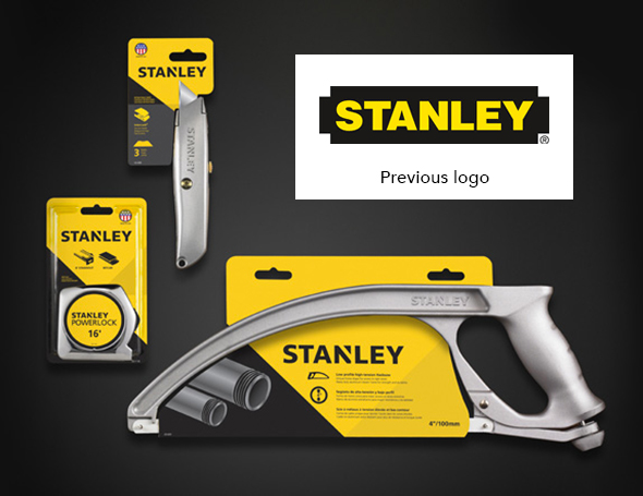
What comes to mind when you think of creative logo design? Some amazing and flashy piece of branding that has the ’wow’ factor? The heart of a good logo and identity has to be centred on the purpose of the branding in the first place. Take the example of the recently redesigned Stanley logo.
The company was established in 1857 and is well-known for its hand tools, power tools, and stuff-making accessories for consumer and industrial use. In 2010, Stanley and Black & Decker merged to form Stanley Black & Decker and since then the Stanley brand has expanded into new industries like security, healthcare, infrastructure, and oilfield services. The brief for the logo and identity had to take all this into consideration. The result by Lippincott is not flashy, just well thought-through creative logo design.
As a result of research including conversations with Stanley employees and customers around the world, Lippincott, came up with a brand position that focused on the concept of ‘Performance in action.’ This brand essence reflected the excellence inherent in every Stanley product, employee, and business.
The stand-out feature of the new logo is the angular cut to the letter ‘N’ in the centre of the word. It is reminiscent of the notches of the surrounding shape in the old logo. This feature is like an arrow that symbolizes the action part of ‘Performance in action.’ Not surprisingly it also retains the yellow and black palette that is associated so strongly with the brand.
Well, has it got the ‘wow’ factor? Maybe not but it’s a great example of logo design that is certainly creative and will help the company with its expansion.
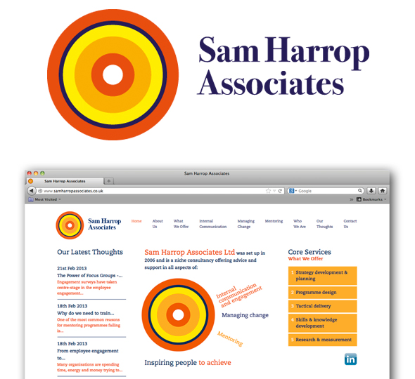
We at Studio Stanley (no connection!), based in Henley-on-Thames, designed a new logo and visual identity for Sam Harrop Associates. They are an employee engagement consultancy that helps businesses to engage their employees and influence the way they feel and behave. The three primary consultants and their associates are all experts in their fields and they target their resources to deliver successful business strategy to both blue-chip organisations and smaller companies.
The logo design takes its cue from the concept of targeting the consultants’ resources to help their clients. The visual identity uses a bold and confident colour palette to reflect their experience, together with clean and contemporary typography. No surprise then that the client said: “Studio Stanley created a strong, vibrant brand and website that clearly explains our business philosophy and services.” Jill Joslin, Consultant and Business Development Director.
Creative logo design can include the ‘wow’ factor but a concept that is grounded in a good understanding of both a business’s past, and its future aspirations, will help that business stay successful. And that after all is point of good design.
Get in touch with us today and let’s start a conversation about how we can be a part of your marketing success.

