Look around you – what do you see?
The chances are that the lettering in front of you will be one of two typefaces (or derivations thereof), and the probability increases vastly if you’re reading this in London (for reasons that will soon become apparent).
Technical terms – fonts and typeface
If we’re being pedantic, the correct term is actually ‘typeface’ – font referred solely to size, although with the rampant Americanisation of the English Language via Microsoft and the like, let’s not hold our breath eh? Hence, nowadays the words typeface and font are used interchangeably.
Fonts were originally known as ‘founts’ going back to the medieval printing press days. In the days when type was set by hand (going back to 1970s Fleet Street rather than medieval days!), a font was the complete set of letters of a typeface in one particular size and style; e.g. Time New Roman, ordinary, size 12.
In these computerised days, there are an almost unlimited number of fonts possible for every typeface, although with old-style physical printing blocks the number of fonts was limited to a handful of those most frequently used.
The typeface family
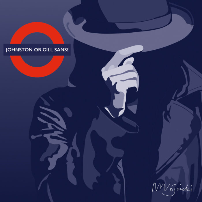
Estimates vary as to how many different typefaces exist – 100,000, 200,000, 300,000? It doesn’t really matter though, because designers tend to use the same typefaces over and over again. And of this multitude of typefaces, two in particular stand out and have stood the test of time – Johnston and Gill.
Edward Johnston and Eric Gill lent their names to the two eponymous typefaces on question – Johnston and Gill (no, not Edward and Eric!) – which will be everywhere around you.
Here’s a brief resumé of their ‘font history’:
Edward Johnston
- Lectured in calligraphy at London St Martin’s School of Art
- Was commissioned to create a unifying identity for London Underground in the early 1900s (see – there’s the London clue!)
- Used a sans serif typeface; i.e. without the flourishes of a classical serif typeface.

Eric Gill
- A stonemason/sculptor who studied under Johnston at night school
- Initially designed a typeface based upon Johnston’s sans serif type for a bookshop in Bristol (Douglas Cleverdon, in case you were interested) which was then picked up by Monotype, a casting company
- Gill Sans first appeared in 1928
- Advancements in printing technology meant that Gill Sans was now available on an industrial scale due to the success of a company called Monotype based in Surrey.

From Johnston to Gill
“The most important thing is that it [the typeface] conveys, thoughts, ideas and images, from one mind to another.”
Beatrice Wards, publicity manager for The Monotype Corporation
Gill’s big break came when Monotype commissioned him to make a typeface for them on behalf of a big customer looking to rebrand; namely LNER (London North Eastern Railway).
Whilst Johnstone had already become the typeface of choice for London, Gill Sans was about to be the typeface of choice for the UK ex-London; that is, once LNER had forced printing companies around Britain to use the Gill Sans typeface throughout its network. And then, when pictures of the world speed record-breaking ‘Mallard’ went ‘viral’ around the world, Gill Sans’ global appeal was cemented.
Monotype did commission other typefaces, such as Joanna (named after Gill’s youngest daughter) and Perpetua (not one of his daughters!). However, with the arrival of the second world war came, the government needed a unified lettering for its propaganda, there was only one obvious choice – Gill Sans.
Conclusion
Johnston and Gill Sans hence represent the bedrock upon which almost all modern commercial fonts are based; for example:
- Helvetica and Univers both emerged from Switzerland in the same year (1957)
- Calibri was designed specifically for Microsoft’s ebook offering in 2002 but became its default online font in 2007 when it replaced Times New Roman
- Times New Roman itself was designed in the early 1930’s by Stanley Morison to update The Times newspaper [note: Morison was a long-time friend of Eric Gill and a long-standing admirer of Edward Johnson].
Hence, modern-day graphic designers owe Edward Johnston and Eric Gill a huge debt of gratitude – without them, the world would be a far duller place (and we might well be out of a job!).
Typefaces are one of the fundamental blocks on which successful brand identities are built on. See how Studio Stanley can create hard-working branding for you.