
Delivering a tangible return on your online investment should be the primary goal of any design agency – it’s no use your website just ‘looking nice’ if it doesn’t drive visitors towards a clear CTA (Call to Action).
Here are tips to help maximise your online value.
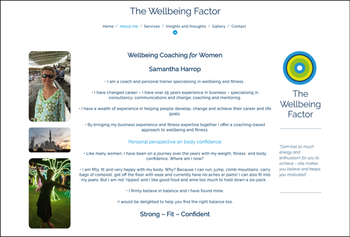
1. One-stop shop: have all the vital information on one page

This is an example of clean design because:
- It is uncluttered – plenty of white space encourages the viewer to engage
- Key information is easily located at a glance – the company name and logo (top-left), contact details (top-right), trade accreditations (bottom-centre), key words (centre)
- The three Ws (Who, How, What) – these are all self-contained in their own boxes.
Your audience want to find what they are looking for with a minimum of conscious effort, so all the key information should be on the one page, whilst encouraging/enticing the reader to through for further information.
Getting that balance right is a vital design consideration.
2. Guide the reader’s eye with typography
- The typeface is Raleway − an elegant sans-serif typeface which is business-like but friendly; a reflection of The Wellbeing Factor’s business approach
- Tiered headings – font size and colour draws the reader’s eye, highlighting the key points whilst breaking up the text
- White background – helps to make the colourful and attractive images ‘pop’ out.
A 2005 report The Aesthetics of Reading stated that ‘good quality typography is responsible for greater engagement during reading’.
Visitors to the website will stay longer and read more if encouraged to do so by the typography.
3. Compelling writing transforms visitors into customers

- Interesting sub-titles – ‘Truly independent / MarketSmart / A one-stop shop’
- Answers the ‘Why’ question – ‘What makes us different?’ Copy and colour – good writing (or copy) on its own is good, but with the addition of colour, fonts and boxes, it commands the reader’s attention.
Websites are different from printed material so the writing style needs to take into account visitors’ preferences and browsing habits.
Come to the point as quickly as possible, use headings, bulleted lists and visual content to break the flow of text blocks, and explain clearly why visitors should use your product/service.
Like to know more about how your existing website could be redesigned?
Get in touch and let’s have a chat: