Dull as dishwater?
There is a fashion now among car manufacturers for logos that don’t try to mimic the reflections and textures of how they would look in cast metal and enamel on a real car, as it was in the 1980s and 1990s.
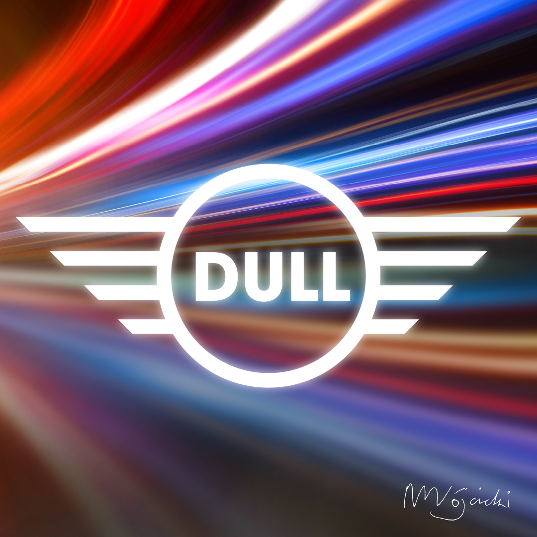
The main argument is that in this digital era logos have to be designed with screens in mind. There are at least seven companies that have rebranded for a simpler, less cluttered look: Mini, Volkswagen, BMW, Citroën, Nissan, Audi, Toyota.
Cover-up job?
When I saw the refreshed Volkswagen logo my immediate thought was that it was drawing a line under the Volkswagen emissions scandal, aka Dieselgate and Emissionsgate.
In 2015 the United States Environmental Protection Agency found that Volkswagen had intentionally programmed turbocharged direct injection diesel engines to activate their emissions controls only during laboratory testing.
However, in real-world driving, the vehicles emitted up to 40 times more of the air polluting nitrogen oxides!
Electric cars, electric cars, electric cars
I was wrong of course: it tied in with the launch of Volkswagen’s first electric production car, the ID.3. It claimed that the updated digital-first branding would mark the start of a new era.
Flat, in my opinion, equals straightforward and honest: no hidden agendas. Others say they just look cheap and boring.

Does flat equal boring?
Citroën flattened its logo in 2016 but has recently updated it again basing the latest iteration on the original logo designed in 1919.
“As we embark on probably the most exciting chapter in our illustrious 103-year history, the time is right for Citroën to adopt a modern and contemporary new look.”
The irony is that the company is looking forward while the logo looks back.
My interpretation is that they are aware that these changes can be unsettling – so they want to reassure their customers that, however new the technology, their longstanding business is rooted in traditions that have lasted the test of time.
To read more about the redesign see the article Citroën returns to original logo to create “symbol of progress” for electric era at dezeen.com.
Graphic design for the early 21st Century
We as a design studio are aware of different trends, be it in technology, business or design itself.
When it comes to designing your logo we won’t short-change you – your business depends on branding that positions your company as the go-to product or service in your sector right now, not the 1980s, or even the 2080s.
See some of our projects here: studiostanley.co.uk/projects
Get in touch and let’s talk about future proofing your business branding.
07817 187 828 | mark.woj@studiostanley.co.uk
Pretty doesn’t guarantee profits.
Branding that communicates with your best customers 24/7 does.


