Mark Harris of Enterprise Doctor delivers effective help to small businesses.
Mark was a mentor at a critical stage of my business and helped to lay strong foundations. During that time I suggested that his logo needed a refresh and he agreed.
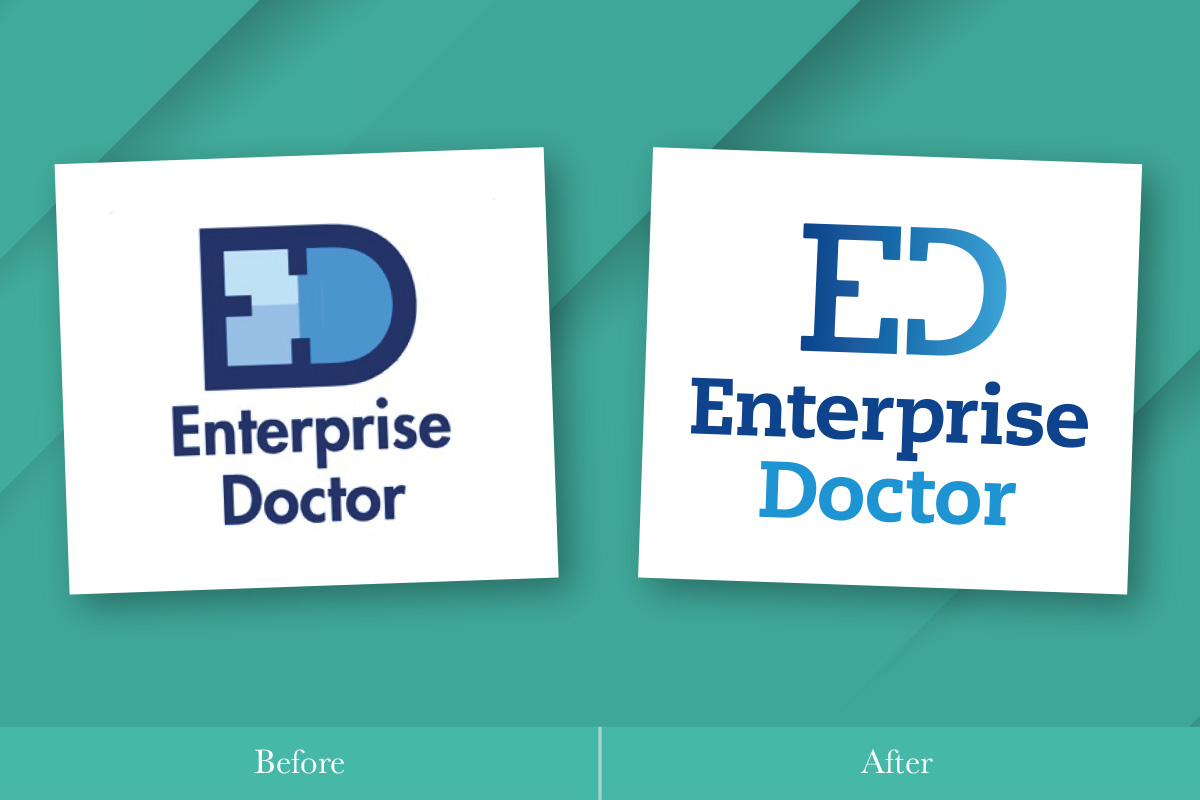
The icon part of the logo, made up of a combination of the letters E and D, expresses the way that Mark’s advice brings health to his clients’ businesses.
The concept was sound but the logo needed an update. I simplified the icon and introduced a graduated tint to suggest the positive progress that results from Mark’s input.
I changed the typeface to PMN Caecilia by Dutch designer Peter Matthias Noordzij. The PMN prefix represents the designer’s initials, and Caecilia is his wife’s name. It is a friendly and versatile slab serif and that’s exactly what Mark is, friendly and versatile!

Mark also runs a business podcast where he discusses business topics with a range of business experts teasing out the secrets of their success. With the new logo and colour palette in place, the cover of the business show was also redesigned.
“I was really impressed with the way that Mark worked with me, drawing out what I wanted to keep from the previous version and understanding what was important to me about the final design.
“I was also impressed with how he introduced new concepts and ideas to me; never imposing his preferences on me, yet making it clear why he thought his ideas were valid.”
Mark Harris, Enterprise Doctor
If you need help with your branding why not take advantage of my diagnostic input and let’s work together to bring your brand back to full health.


